Insights – Designing a Scalable Data Repository for Paediatric Cancer Research
Insights – Designing a Scalable Data Repository for Paediatric Cancer Research
As the ZERO dataset expanded, Phase 3 focused on turning that data into something usable.
Leading I product design across UX, UI, IA, and design system improvements, we designed Insights as the evolution of MTB Notes — a platform to help CCI teams and researchers explore ZERO data in meaningful ways, from big-picture trends to detailed analysis, no technical skills required.
Client
Client
Children's Cancer Institute (CCI)
Children's Cancer Institute (CCI)
Year
Year
2024
2024
Category
Category
Health Tech, Data Platform
Health Tech, Data Platform
Type
Type
Product Design, Design System, Data Visualisation
Product Design, Design System, Data Visualisation

Problem / Context
Problem / Context
CCI had a mix of tools — MTB Notes, Beacon, and internal reports — but they were fragmented and not designed for scale. Advanced querying was possible, but not accessible. Most users, especially those without a technical background, had to request help to run searches, even though the data was already available.
The brief was broad. We were handed a long list of potential features, references to platforms like KidsFirst and PeCan, and a general goal to make ZERO data more accessible. It also wasn’t clear whether Insights would live within ZeroDash or be a standalone platform.
What was clear was the challenge. We needed to turn a complex, sensitive dataset into something useful for a wide range of users — many of whom weren’t confident navigating raw data or writing queries.
Problem / Context
CCI had a mix of tools — MTB Notes, Beacon, and internal reports — but they were fragmented and not designed for scale. Advanced querying was possible, but not accessible. Most users, especially those without a technical background, had to request help to run searches, even though the data was already available.
The brief was broad. We were handed a long list of potential features, references to platforms like KidsFirst and PeCan, and a general goal to make ZERO data more accessible. It also wasn’t clear whether Insights would live within ZeroDash or be a standalone platform.
What was clear was the challenge. We needed to turn a complex, sensitive dataset into something useful for a wide range of users — many of whom weren’t confident navigating raw data or writing queries.
Approach
Approach
Getting aligned
Before jumping into design, our team (me and our in-house PM) worked closely with CCI — mainly the precision medicine informatics manager and lead developer we’d partnered with in Phase 2 — to unpack the feature list and clarify expectations. We grouped ideas into must-haves, nice-to-haves, and stretch goals, which gave us a clearer starting point and let us design with purpose.
Changing gears
Even with that groundwork, early progress was slow. Weekly check-ins weren’t cutting it, and the designs weren’t landing. We were iterating in circles without a shared vision. Drawing from our approach in Phase 2, I suggested we shift to longer, twice-weekly co-design sessions. This gave us the space to align properly and work through the fundamentals of the platform together.
After a few frustrating weeks, the team was feeling flat. To reset, we paused the complex bits and focused on a simpler piece — the high-level summary view with broader filters and data visualisation. In hindsight, starting there was the right call. It gave us a tangible win, helped clarify the mechanics we’d later use in the deeper data views, and gave the team the momentum to push through the rest. We ended up finishing the project ahead of schedule.
Approach
Getting aligned
Before jumping into design, our team (me and our in-house PM) worked closely with CCI — mainly the precision medicine informatics manager and lead developer we’d partnered with in Phase 2 — to unpack the feature list and clarify expectations. We grouped ideas into must-haves, nice-to-haves, and stretch goals, which gave us a clearer starting point and let us design with purpose.
Changing gears
Even with that groundwork, early progress was slow. Weekly check-ins weren’t cutting it, and the designs weren’t landing. We were iterating in circles without a shared vision. Drawing from our approach in Phase 2, I suggested we shift to longer, twice-weekly co-design sessions. This gave us the space to align properly and work through the fundamentals of the platform together.
After a few frustrating weeks, the team was feeling flat. To reset, we paused the complex bits and focused on a simpler piece — the high-level summary view with broader filters and data visualisation. In hindsight, starting there was the right call. It gave us a tangible win, helped clarify the mechanics we’d later use in the deeper data views, and gave the team the momentum to push through the rest. We ended up finishing the project ahead of schedule.

Key Work & Outcomes
Key Work & Outcomes
Making filtering usable
One of the biggest blockers in previous tools was filtering. Researchers and clinicians often had to ask the MTB Notes team to run specific queries for them — the system just wasn’t built for self-serve.
I designed a new filtering model that let users visually build queries across key attributes like cancer type, sequencing availability, demographics, and treatment history. We refined the approach through internal testing and regular feedback with CCI, and it quickly became the backbone of the platform.
This turned a frustrating, opaque process into something clear, fast, and intuitive.
Visualising data with purpose
We rethought the visual layer to make it easier to spot patterns and gaps across the program. PowerBI mockups provided a loose reference, but we needed a cleaner and more structured experience.
One example was a heatmap-style view that showed patient sequencing combinations — WGS, RNAseq, Methylation — grouped by cohort size. It was a novel way to scan for coverage and quickly surfaced insights that had previously been buried.
Where possible, we reused familiar visual patterns from tools like PeCan to keep things usable without overengineering.
Designing tables that scale
Tables were unavoidable, but the datasets were massive — dozens of columns, hundreds of rows, and deeply nested metadata.
I designed a custom interaction for one of the most complex columns, allowing users to explore detailed data without losing context. It blended standard patterns with new ones tailored for this use case, and it became one of the more distinctive features of the platform. Client feedback on this was great.
Catering to different users
The platform had to work for both high-level stakeholders and hands-on researchers. We split the experience into two main sections:
Highlights for key metrics and program-level insights
Deep Dive for patient-level and genomic data
This structure gave each audience a clear path in, without cluttering the experience for everyone else.
Key Work & Outcomes
Making filtering usable
One of the biggest blockers in previous tools was filtering. Researchers and clinicians often had to ask the MTB Notes team to run specific queries for them — the system just wasn’t built for self-serve.
I designed a new filtering model that let users visually build queries across key attributes like cancer type, sequencing availability, demographics, and treatment history. We refined the approach through internal testing and regular feedback with CCI, and it quickly became the backbone of the platform.
This turned a frustrating, opaque process into something clear, fast, and intuitive.
Visualising data with purpose
We rethought the visual layer to make it easier to spot patterns and gaps across the program. PowerBI mockups provided a loose reference, but we needed a cleaner and more structured experience.
One example was a heatmap-style view that showed patient sequencing combinations — WGS, RNAseq, Methylation — grouped by cohort size. It was a novel way to scan for coverage and quickly surfaced insights that had previously been buried.
Where possible, we reused familiar visual patterns from tools like PeCan to keep things usable without overengineering.
Designing tables that scale
Tables were unavoidable, but the datasets were massive — dozens of columns, hundreds of rows, and deeply nested metadata.
I designed a custom interaction for one of the most complex columns, allowing users to explore detailed data without losing context. It blended standard patterns with new ones tailored for this use case, and it became one of the more distinctive features of the platform. Client feedback on this was great.
Catering to different users
The platform had to work for both high-level stakeholders and hands-on researchers. We split the experience into two main sections:
Highlights for key metrics and program-level insights
Deep Dive for patient-level and genomic data
This structure gave each audience a clear path in, without cluttering the experience for everyone else.

Impact
Impact
Despite an uncertain start, the project was delivered ahead of schedule and met all its defined goals. For a fixed-price engagement involving this level of data and subject matter complexity, this was a significant achievement.
What we were able to achieve:
A scalable, accessible repository of paediatric cancer research data
A first-of-its-kind platform that connected genomic data with actual treatment recommendations from the ZERO program
An intuitive filtering and querying experience designed for clinicians and researchers
A clear visual design language that improved usability and accessibility for all user types
Internal rollout to the wider CCI team, with strong positive feedback across departments
"We came to We Discover with an incredibly complex design problem, and they met us with unparalleled patience, attention to detail and insight in addition to excellent project management.They succeeded in delivering a product that offered a graceful solution without compromising on thoughtful and intentional design.”
Client testimonial from Kam Taouk, Senior Software Engineer, Children's Cancer Institute
Impact
Despite an uncertain start, the project was delivered ahead of schedule and met all its defined goals. For a fixed-price engagement involving this level of data and subject matter complexity, this was a significant achievement.
What we were able to achieve:
A scalable, accessible repository of paediatric cancer research data
A first-of-its-kind platform that connected genomic data with actual treatment recommendations from the ZERO program
An intuitive filtering and querying experience designed for clinicians and researchers
A clear visual design language that improved usability and accessibility for all user types
Internal rollout to the wider CCI team, with strong positive feedback across departments
"We came to We Discover with an incredibly complex design problem, and they met us with unparalleled patience, attention to detail and insight in addition to excellent project management.They succeeded in delivering a product that offered a graceful solution without compromising on thoughtful and intentional design.”
Client testimonial from Kam Taouk, Senior Software Engineer, Children's Cancer Institute
Reflections
Reflections
This was my first opportunity to lead a complex product design engagement from start to finish. The early stages were tough, but once we found our footing, the collaboration was some of the best I’ve been part of. Everyone cared deeply about the outcome.
What stood out most was how design made a real difference. We were able to take something deeply technical and transform it into something usable and meaningful for people working on the front lines of paediatric cancer.
Reflections
This was my first opportunity to lead a complex product design engagement from start to finish. The early stages were tough, but once we found our footing, the collaboration was some of the best I’ve been part of. Everyone cared deeply about the outcome.
What stood out most was how design made a real difference. We were able to take something deeply technical and transform it into something usable and meaningful for people working on the front lines of paediatric cancer.

More Projects
More Projects
More Projects
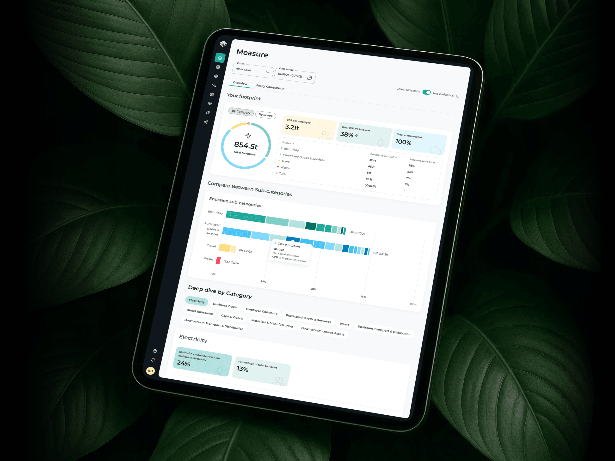
Trace
Sustainability Tech
2022 - Ongoing
2022 - Ongoing
Trace
Sustainability Tech
2022 - Ongoing
2022 - Ongoing
Trace
Sustainability Tech
2022 - Ongoing
2022 - Ongoing
Trace
Sustainability Tech
2022 - Ongoing
2022 - Ongoing

Gorgias
E-Commerce, SaaS, AI
Type
2024
2024
Gorgias
E-Commerce, SaaS, AI
Type
2024
2024
Gorgias
E-Commerce, SaaS, AI
Type
2024
2024
Gorgias
E-Commerce, SaaS, AI
Type
2024
2024
©2025 YIDA TAN
GO BACK TO TOP
©2025 YIDA TAN
GO BACK TO TOP