Gorilla Studio – A Sophisticated Rebrand for a Design-Led Construction Studio
Gorilla Studio – A Sophisticated Rebrand for a Design-Led Construction Studio
Gorilla Studio, formerly Gorilla Construction, was repositioning itself from a high-end builder into a more design-forward partner for luxury hospitality fit-outs and bespoke renovations. The goal was to evolve the brand into something more refined, modern, and aligned with leading architectural aesthetics without losing the strength and reliability associated with its original name.
Working alongside Ash (Head of Design at We Discover), I co-led the conceptual phase of the rebrand. Each of us developed a distinct visual identity proposal, which were then presented back to the client, and later refined and evolved together into three variants, one of which became the final identity.
Client
Client
Gorilla Studio
Gorilla Studio
Year
Year
2024
2024
Category
Category
Building
Building
Type
Type
Branding, Creative Direction
Branding, Creative Direction
Creative Direction
Creative Direction
The identity needed to bridge design sophistication with construction credibility — modern, minimal, but unmistakably bold. My chosen direction leaned into this duality through:
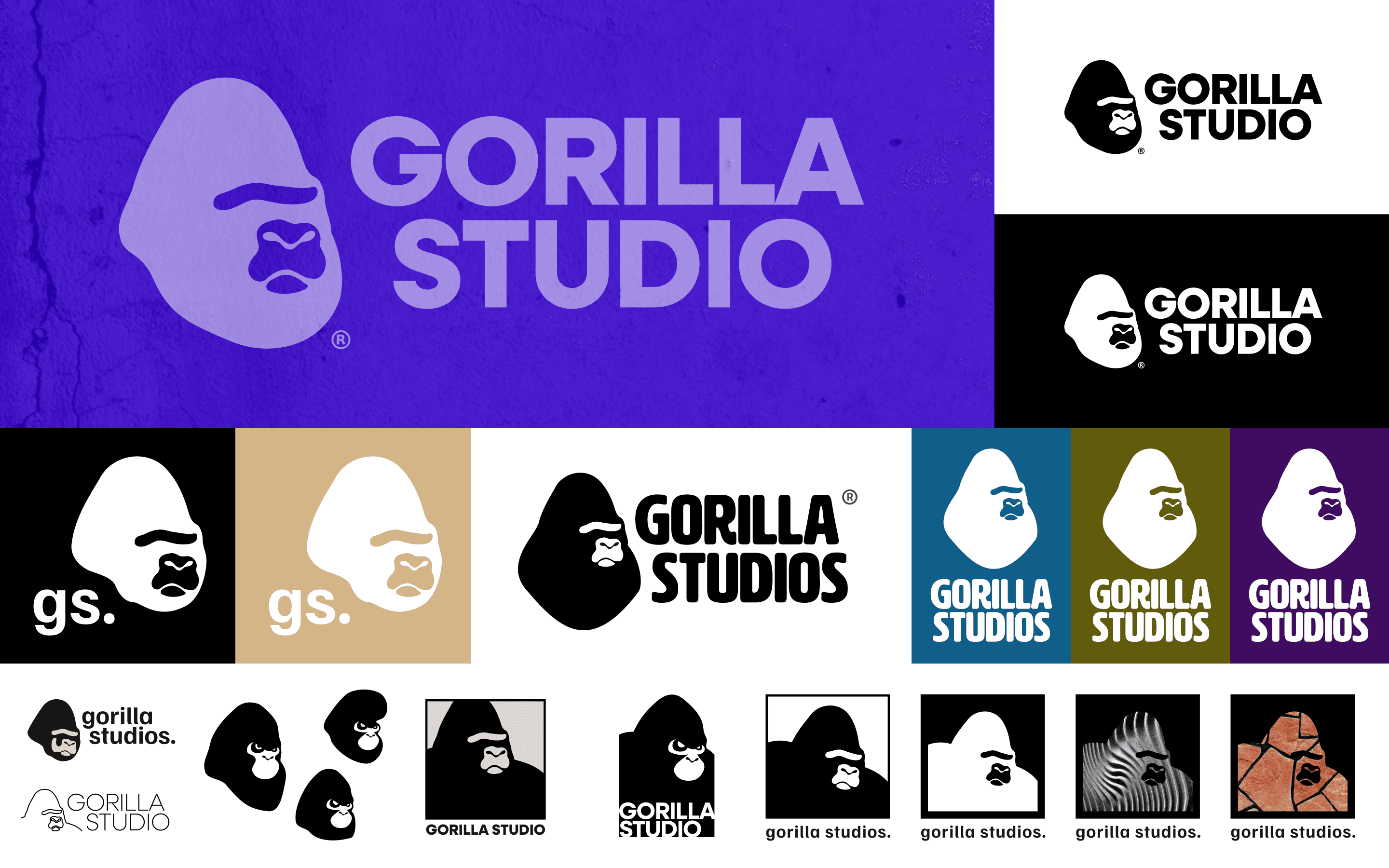
A stylised gorilla mark used as a core brand element — serious but abstract, bold but flexible
A confident, typographically driven logo system that allowed for clear lockups across formats
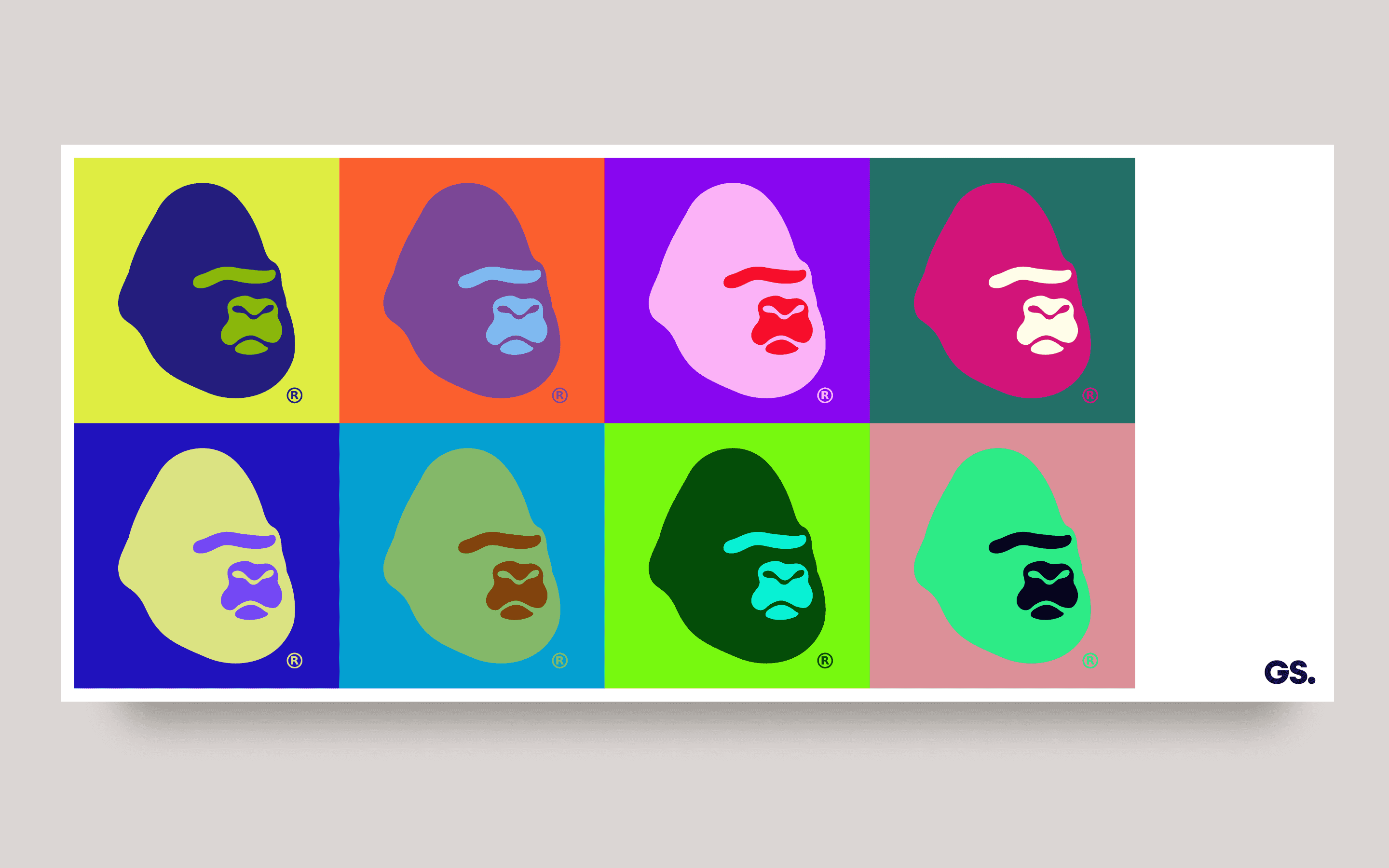
A core palette built on purples and lime — signalling creativity and luxury while offering strong contrast
Thematic applications of textural fills (e.g. timber, concrete, stone, greenery) to reflect material tactility and project diversity
The identity needed to bridge design sophistication with construction credibility — modern, minimal, but unmistakably bold. My chosen direction leaned into this duality through:
A stylised gorilla mark used as a core brand element — serious but abstract, bold but flexible
A confident, typographically driven logo system that allowed for clear lockups across formats
A core palette built on purples and lime — signalling creativity and luxury while offering strong contrast
Thematic applications of textural fills (e.g. timber, concrete, stone, greenery) to reflect material tactility and project diversity
Creative Direction
The identity needed to bridge design sophistication with construction credibility — modern, minimal, but unmistakably bold. My chosen direction leaned into this duality through:
A stylised gorilla mark used as a core brand element — serious but abstract, bold but flexible
A confident, typographically driven logo system that allowed for clear lockups across formats
A core palette built on purples and lime — signalling creativity and luxury while offering strong contrast
Thematic applications of textural fills (e.g. timber, concrete, stone, greenery) to reflect material tactility and project diversity
Process
Process
We went through several iterations, exploring colour systems, layout grids, and applications across different mediums. This was not just a logo project — it was a design system for a business transitioning into a new chapter.
The final brand guide delivered:
Primary and alternate logos
Brandmark usage with material fills
Colour palette and rationale
Logo spacing and lockup rules
Versatile digital and print applications
An extensive visual exploration supported the final decision, helping the client understand the range of aesthetic directions available — from editorial minimalism to high-saturation boldness.
Process
We went through several iterations, exploring colour systems, layout grids, and applications across different mediums. This was not just a logo project — it was a design system for a business transitioning into a new chapter.
The final brand guide delivered:
Primary and alternate logos
Brandmark usage with material fills
Colour palette and rationale
Logo spacing and lockup rules
Versatile digital and print applications
An extensive visual exploration supported the final decision, helping the client understand the range of aesthetic directions available — from editorial minimalism to high-saturation boldness.

Outcome
Outcome
The selected direction became the foundation for Gorilla Studio’s rebrand
Delivered a flexible system that balanced luxury and construction appeal
Set the visual tone for website, pitch decks, and physical materials
The selected direction became the foundation for Gorilla Studio’s rebrand
Delivered a flexible system that balanced luxury and construction appeal
Set the visual tone for website, pitch decks, and physical materials
Outcome
The selected direction became the foundation for Gorilla Studio’s rebrand
Delivered a flexible system that balanced luxury and construction appeal
Set the visual tone for website, pitch decks, and physical materials

More Projects
More Projects
More Projects

Zip Co.
Fintech, BNPL
2021 - 2022
2021 - 2022
Zip Co.
Fintech, BNPL
2021 - 2022
2021 - 2022
Zip Co.
Fintech, BNPL
2021 - 2022
2021 - 2022
Zip Co.
Fintech, BNPL
2021 - 2022
2021 - 2022

Children's Cancer Institute Australia - "ZeroDash"
Health Tech
Type
2023
2023
Children's Cancer Institute Australia - "ZeroDash"
Health Tech
Type
2023
2023
Children's Cancer Institute Australia - "ZeroDash"
Health Tech
Type
2023
2023
Children's Cancer Institute Australia - "ZeroDash"
Health Tech
Type
2023
2023
©2025 YIDA TAN
GO BACK TO TOP
©2025 YIDA TAN
GO BACK TO TOP